Capri Global / Collect Express
Rebuilding how 500+ agents collect loan payments
Capri Global's field agents were ignoring their own collection app and running operations through WhatsApp. I redesigned Collect Express from the ground up, turning a 3-month learning curve into a 2-week one by replacing complex workflows with focused, single-task screens that matched how agents actually work in the field.
Overview
Capri Global is a listed NBFC in India that offers secured and unsecured loans, including gold loans, MSME loans, and construction finance. When borrowers fall behind on payments, Capri relies on a dedicated team of field recovery agents who physically visit customers to collect payments or negotiate repayment plans.
To support this team, Capri had built an internal Android app called Collect Express. The problem: agents weren't using it. They'd open it because their managers required it, do the bare minimum, then switch back to WhatsApp and spreadsheets to actually get their work done.
I was brought in to redesign the app end-to-end.
The problem
We flew to Capri's Pune office and spent several days embedded with the team, shadowing three agents on their daily routes and sitting with two managers. What we found was worse than a bad interface. It was an app built around an imagined workflow that didn't match how anyone actually worked.
Agents ran their entire day through WhatsApp. Managers sent daily customer lists on WhatsApp. Agents sent visit updates on WhatsApp. Payment confirmations went through WhatsApp. The app that was supposed to replace all of this was sitting in the background, unused for anything beyond compliance checkboxes.
The learning curve was nearly three months. The app was dense with domain-specific jargon that even managers struggled to explain. The incentive screen, the single feature agents cared most about, used terminology so unclear that agents couldn't tell how their daily work translated into money in their pocket.
Workflows were either broken or missing entirely. Leave scheduling, expense reporting: agents had quietly reverted to older systems for these because the app's versions were either incomplete or so painful to use that they weren't worth the effort.
The architecture fought the user at every step. To visit a single customer, an agent had to navigate through customer selection, route planning, target setting, and a cluttered visit screen. One of those steps, daily target-setting, turned out to be a leftover data collection exercise from an internal study. It had no value to the agent at all, but it sat in the critical path of every single workday.
The bottom line: agents used the app because they were told to, not because it helped them.
How we solved it
We redesigned around two core workflows, not forty scattered features. The entire app collapsed into two things agents actually need: visiting customers and tracking incentives. Everything else became secondary or was removed.
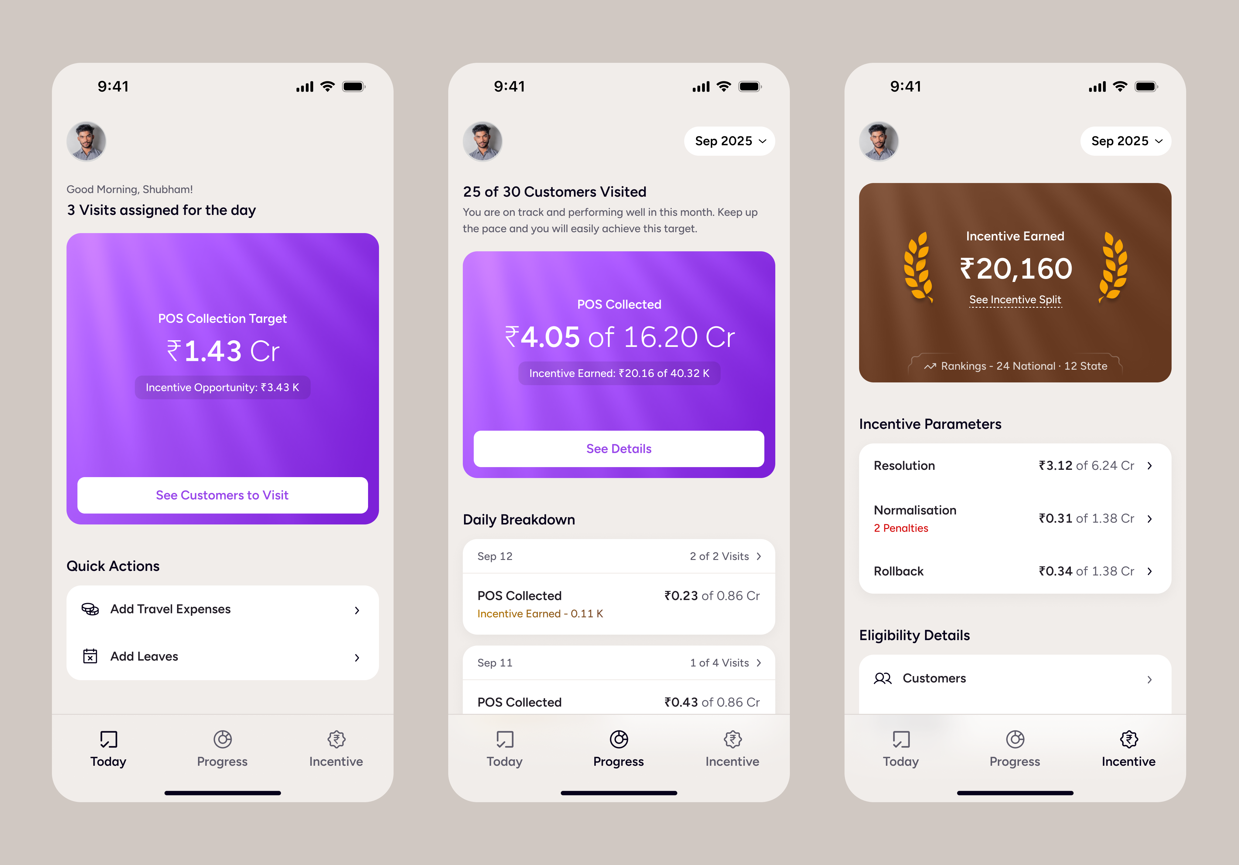
The visit workflow
We broke a tangled process into four focused sub-flows: select customers, optimise the route, set the day's plan, and visit one customer at a time. The old app showed all customers and all routes simultaneously, creating a wall of information. The new design focuses the agent on one customer, one route, one action at a time.
Key decisions included replacing the WhatsApp-based customer list with a direct manager-to-agent assignment feature built into the companion web app. We added a yesterday's performance overview at the start of each day, because an agent's priorities today depend entirely on what happened yesterday. We simplified customer cards to show only the information needed to take the next action. And we recommended removing the mandatory daily target-setting step entirely, or at minimum making it optional, since it was adding cognitive load with zero agent value.
The incentive workflow
We tackled the clarity problem head-on. The old screen used terms like "Bucket 61-90" and "Normalisation" without explanation. Agents couldn't connect their daily actions to their monthly payout. We introduced a badge-based gamification system where agents earn progressively higher badges as their collections increase. Each incentive parameter got its own visual progress bar so agents could see exactly where they stood. Penalty thresholds, previously invisible, became explicit with clear icons showing what an agent needed to hit to avoid losing earnings.
We also added contextual definitions for every domain-specific term, accessible with a single tap. If a manager couldn't explain "normalisation" in plain language, the app shouldn't assume agents would figure it out on their own.
Impact
Reduced learning time from ~3 months to a 2-week target. By eliminating jargon, simplifying architecture, and designing single-task screens, new agents could be productive within their first two weeks instead of spending a quarter learning the tool.
Decreased time to schedule a customer visit. The old flow required navigating through multiple screens and a mandatory target-setting step before an agent could start their day. The new flow gets agents from launch to first customer in a fraction of the steps.
Increased incentives earned per agent. By making the incentive structure transparent and showing agents exactly which actions drove their payouts, agents could make better decisions about which customers to prioritise.
Eliminated dependency on WhatsApp for core workflows. Customer assignments, visit updates, and payment tracking all moved inside the app, giving managers a single source of truth instead of scattered chat threads.
Want the full picture?
Field research documentation, before-and-after screen breakdowns, the incentive gamification system, and interaction patterns from shadowing agents are available on request.
Request Walkthrough