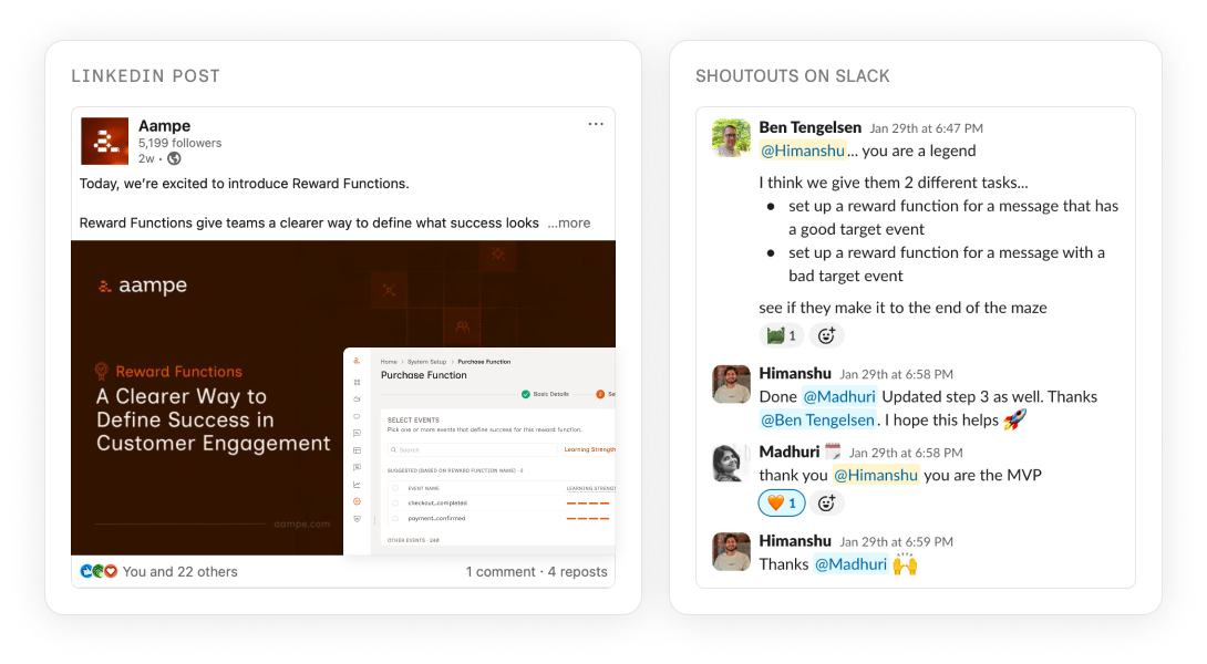
AI Messaging Platform / Reward Functions
Letting marketers define success for AI agents
This case study is about how I helped marketers tell those agents what to optimise for, per campaign. Before this, every campaign got judged by the same definition of success. So a referral push would be measured by subscriptions, and the agent would learn from the wrong signal.
About Aampe
Aampe is a B2B agentic AI platform that personalises marketing messages for consumer apps. Its AI agents learn which messages work by tracking success events, then reinforce the ones that perform. Customers include category leaders in music streaming (Deezer), fintech (Taxfix), and two-sided marketplaces (Carousel).
Why this case study
I traced a customer complaint about broken metrics to an architectural flaw nobody had picked up, then designed the feature that fixed it. Sharing this one because it covers the parts of design I care about most: finding the real problem, working closely with engineering, testing with real customers, and shipping with restraint.
The short version is below. The long version is a conversation.
If this work looks like the shape of designer you're hiring, I'd rather walk you through it than ask you to read everything. A 45-minute call gets you the parts a written case study can't: the trade-offs, the dead ends, the calls I'd make differently today.
How the problem surfaced
The way this problem got surfaced is actually one of my favourite parts of the story.
At Aampe, we'd started a ritual in September called Conceptual Hour. Every two weeks, one designer would pick a problem they cared about, go deep on it, and present back what they found.
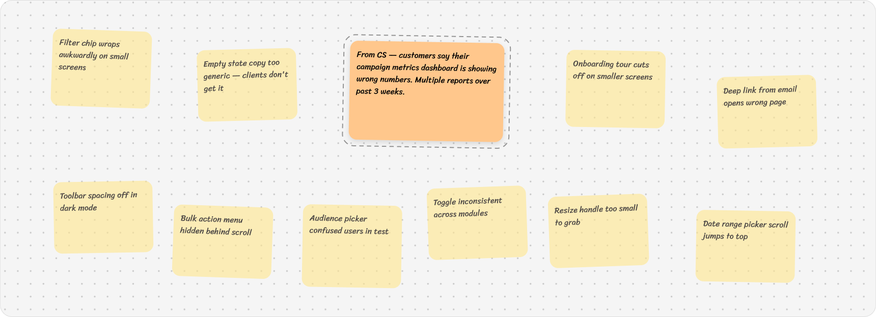
The problems came from a FigJam board we called Pain Depot. We'd been collecting friction in there for months. Slack threads from CS, things we'd noticed in design audits, customer complaints that came through.
In December, it was my turn to present.
Same campaign, opposite verdicts
Once I opened the sticky and dug in, here's what I found.
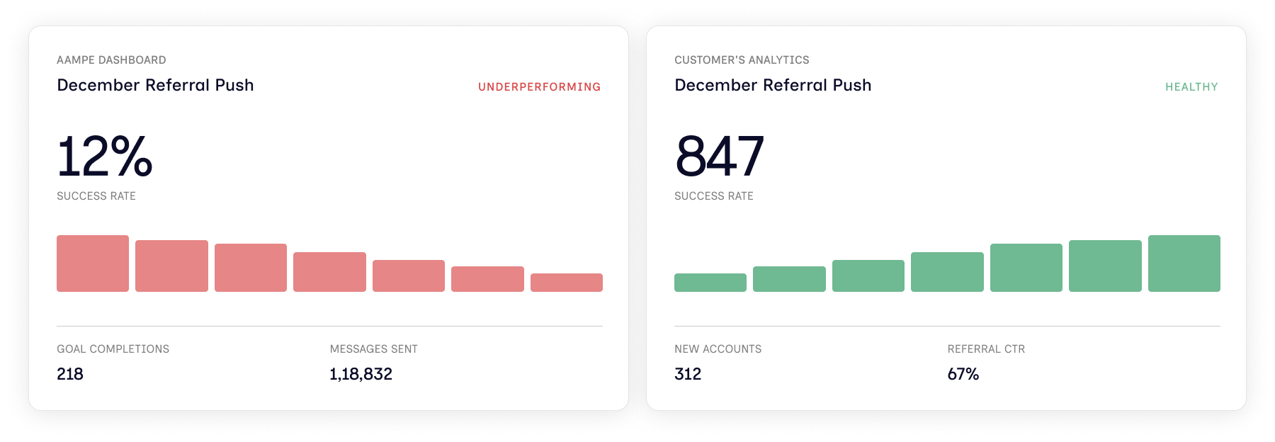
A customer ran a referral campaign. Aampe's dashboard said it was failing. Their own analytics said it was performing well.
Neither of them was wrong. They were just measuring two different things.
Anything that looks like a metrics problem, people send to data science. So that's where I started. I sat down with the data scientist expecting a math mistake. We didn't find one.
It wasn't a calculation issue. It was architectural.
At Aampe, every customer gets one reward function.
A reward function is basically the success metric the agent uses to judge how every campaign is doing. We set it once, during customer onboarding. Set in stone. Acts as a north star for everything that runs after.
For a music app like Spotify, the reward function might be when someone subscribes. So that one event becomes the yardstick for everything. A subscription push gets judged on it. A retention campaign gets judged on it. Even a referral campaign gets judged on it. Which is the problem, because a referral campaign isn't about subscriptions. It's about getting your existing users to bring in new ones.
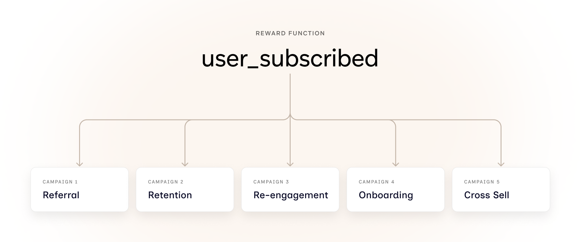
One function couldn't carry every campaign
Once I understood the problem, I sat down with the data scientist and my design manager. We mapped out four directions before picking one.
Option 1: Fix the dashboard, not the system
Fixing the dashboard would hide the problem, not solve it.
Option 2: One reward function, weighted differently per campaign
Weighting one function differently per campaign was the same root problem in a new wrapper.
Option 3: A fixed library of reward functions to choose from
A fixed library of reward functions wouldn't scale across customer types.
Option 4: Multiple reward functions per customer
This is where we finalised. Each customer gets more than one reward function, and marketers pick the right one per campaign. It put the decision in the right hands. It scaled across customer types. And it solved a problem we hadn't even set out to fix. Two-sided marketplaces, where the same user can be a buyer and a seller, suddenly had a way to be modeled properly. One reward function could never represent both sides of that user.
Setting the bar before designing
Before any of this became a feature, we needed to be honest about what good looked like. Not just shipping it, but making sure marketers actually reached for it on their own.
Objectives:
Match the platform to how marketers actually think about campaigns.
Cut customer setup time from weeks to hours.
Reduce dependency on data scientists and engineers.
Success metrics:
Self-serve rate (marketers setting reward functions without CS help),
reward functions in active use across campaigns, and
campaign metric accuracy (whether the dashboard numbers matched what customers expected, which was the original complaint).
Designing alongside engineering, not after
Before opening Figma, I needed technical grounding before designing anything. I wanted to know how the agent's pipeline would handle multiple reward functions. What was learnable. What shape the data needed to take.
So I sat back down with the engineers and the data scientist. To move us forward, the data scientist threw together a quick HTML prototype. Internal alignment, not a user-facing thing.
The data scientist's prototype was great for the team but spoke fluent data science. Useless for the marketer who'd actually live inside this feature. So while the engineering side took shape, I started building the experience for the person who'd use it.
With the engineering side clearer, I moved into Figma. I started with a handful of static screens, just to align the team on the broad strokes of how the flow would feel. But static screens weren't going to cut it for testing.
Marketers needed to click, fumble, get stuck, and come back. So I built a working prototype in Figma Make. Real interactions. Working warnings. Supporting-event flows that actually behaved.
Figma Make let me move fast without pulling engineering in. A few hours of work, and we had something marketers could touch
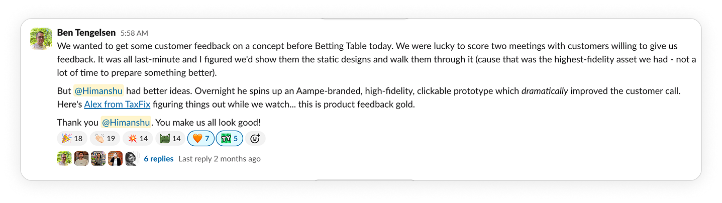
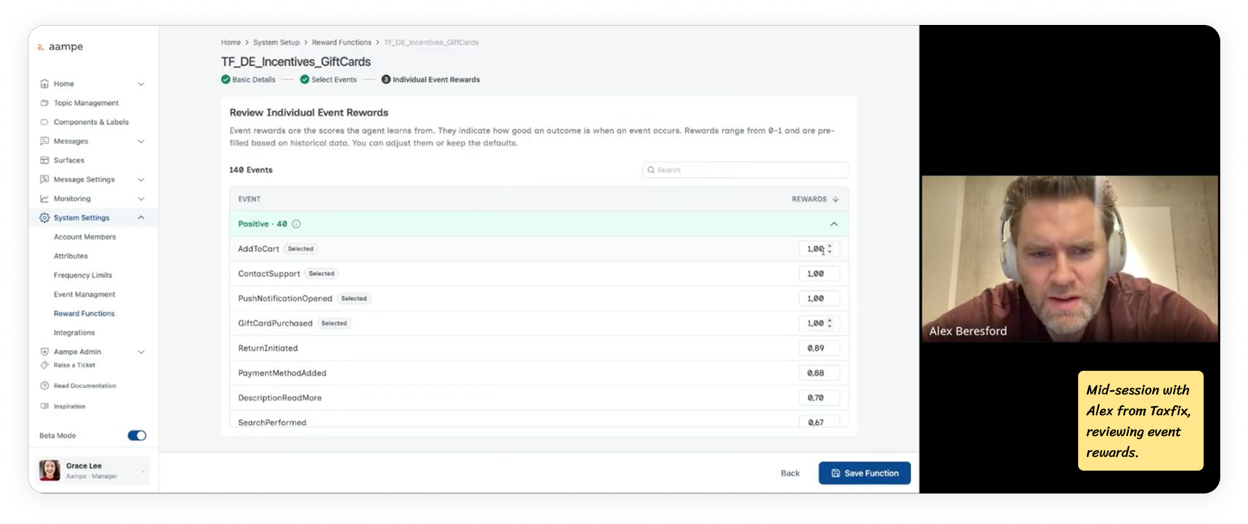
Testing with two customers from different industries
We ran the prototype with two customers from different industries. Deezer on the music streaming side. Taxfix on the fintech side. Deezer cared about subscriptions. Taxfix cared about people completing tax filings. Same flow, very different definitions of success.
I ran moderated sessions with marketers from both teams. About an hour each, 4 sessions per customer. They worked through the flow while I watched.
Watching real marketers click through it surfaced things internal review never did. That fed directly into the final designs.
Two core workflows, shaped by testing
The feature ships with two workflows.
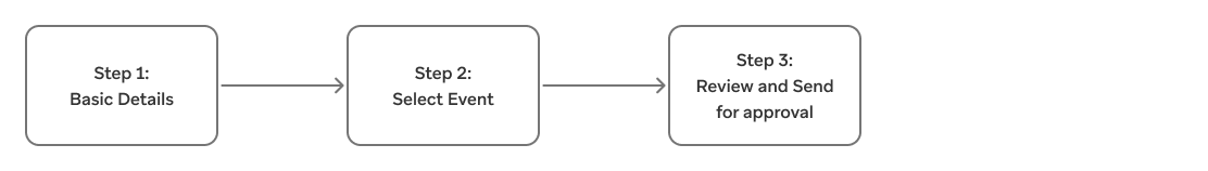
Workflow 1: High-Signal Event
The agent had enough data to learn from. The marketer named the reward function, confirmed, done. One screen, one decision.
Workflow 2: Low-signal event
The agent couldn't learn fast enough alone. The flow opened up to let the marketer add supporting events. Higher-frequency events that sit close to the real goal, which the agent could learn from in the meantime.
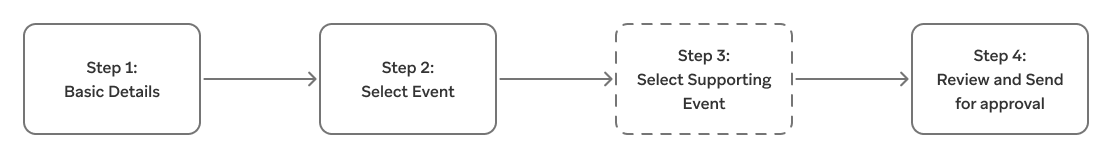
This split matters because the agent learns from how often an event fires. A high-frequency event gives it enough signal on its own. A low-frequency event doesn't, which is why it needs its own flow.
Workflow 1: The happy flow
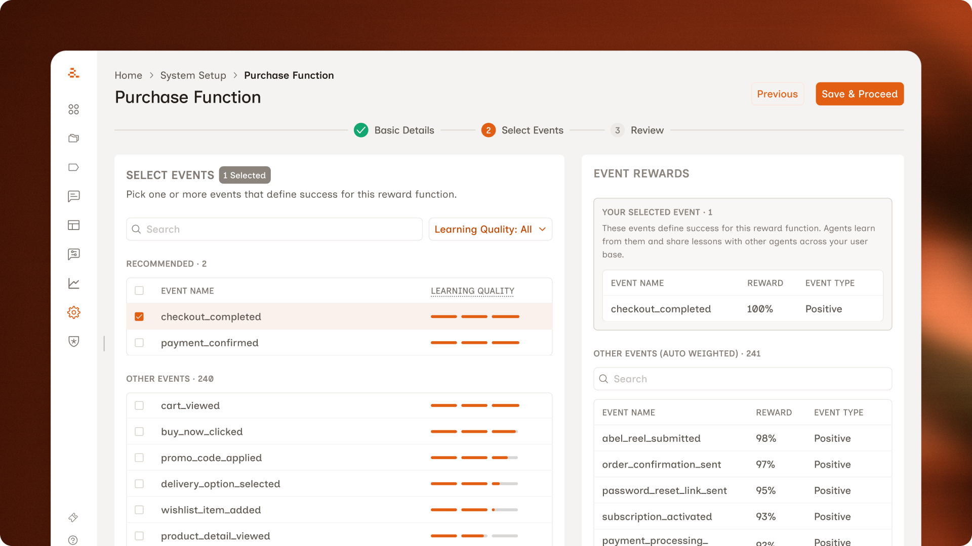
For a high-signal event, the flow is three screens plus a confirmation. Most of it stayed close to the original direction. The changes came from watching what marketers did when they actually used it.
Step 1: Enter Basic Details
The first step of the flow. Marketers name the reward function, write a short description, and pick the topics it should apply to.
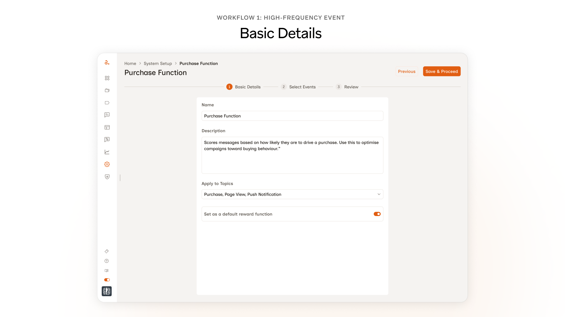
Nothing changed here, and that's on purpose. In testing, marketers named the function, wrote a short description, picked the topics, and moved on. No confusion, no friction, no requests for changes. The temptation to redesign every screen is real, but the better move was to spend the design budget where marketers actually needed help.
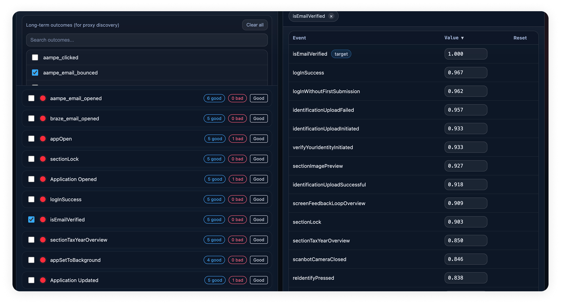
Step 2: Select Events
This is where most of the design work in Workflow 1 lives. Three changes came out of testing, each one tied to a specific moment in the session.
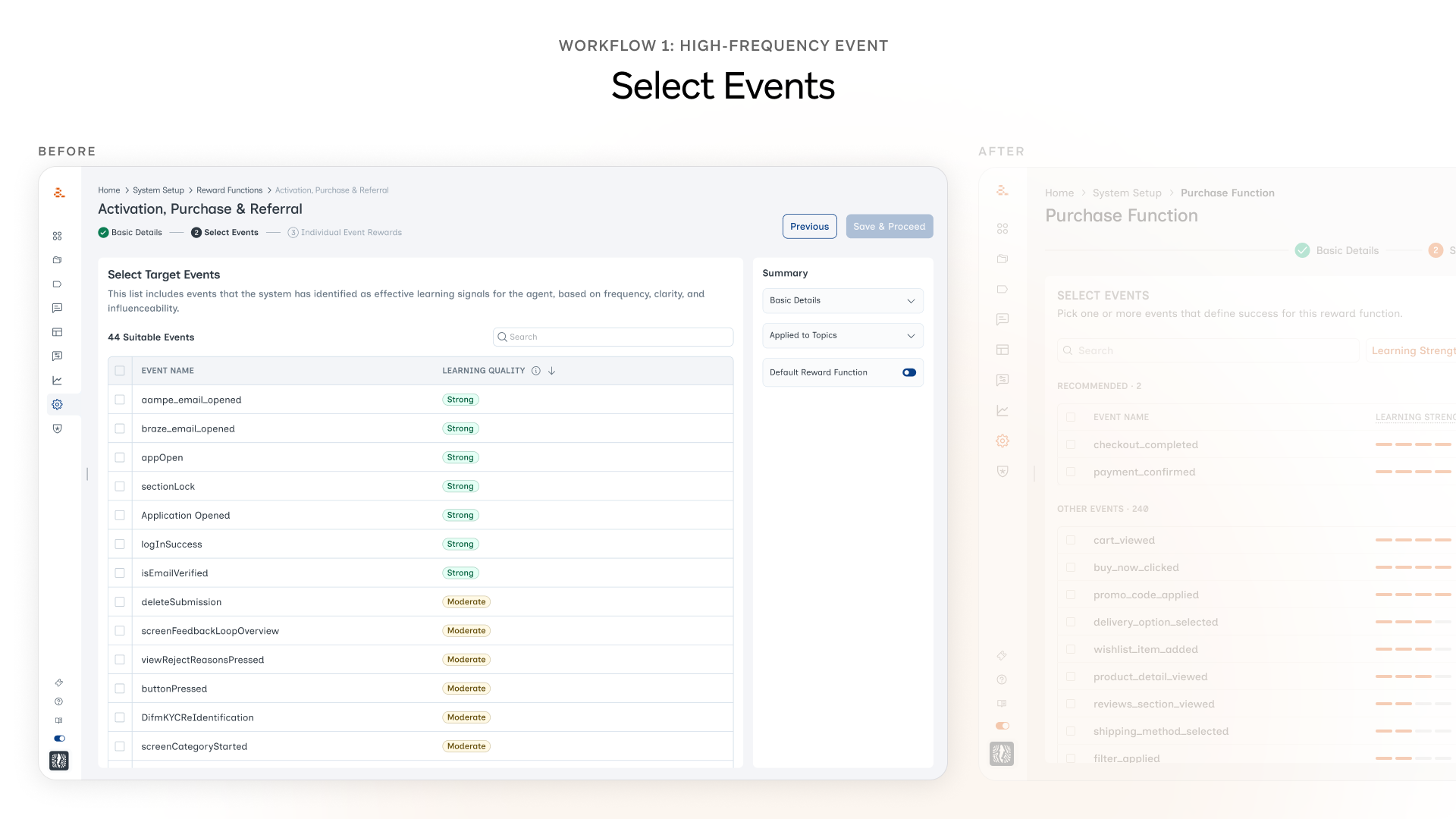
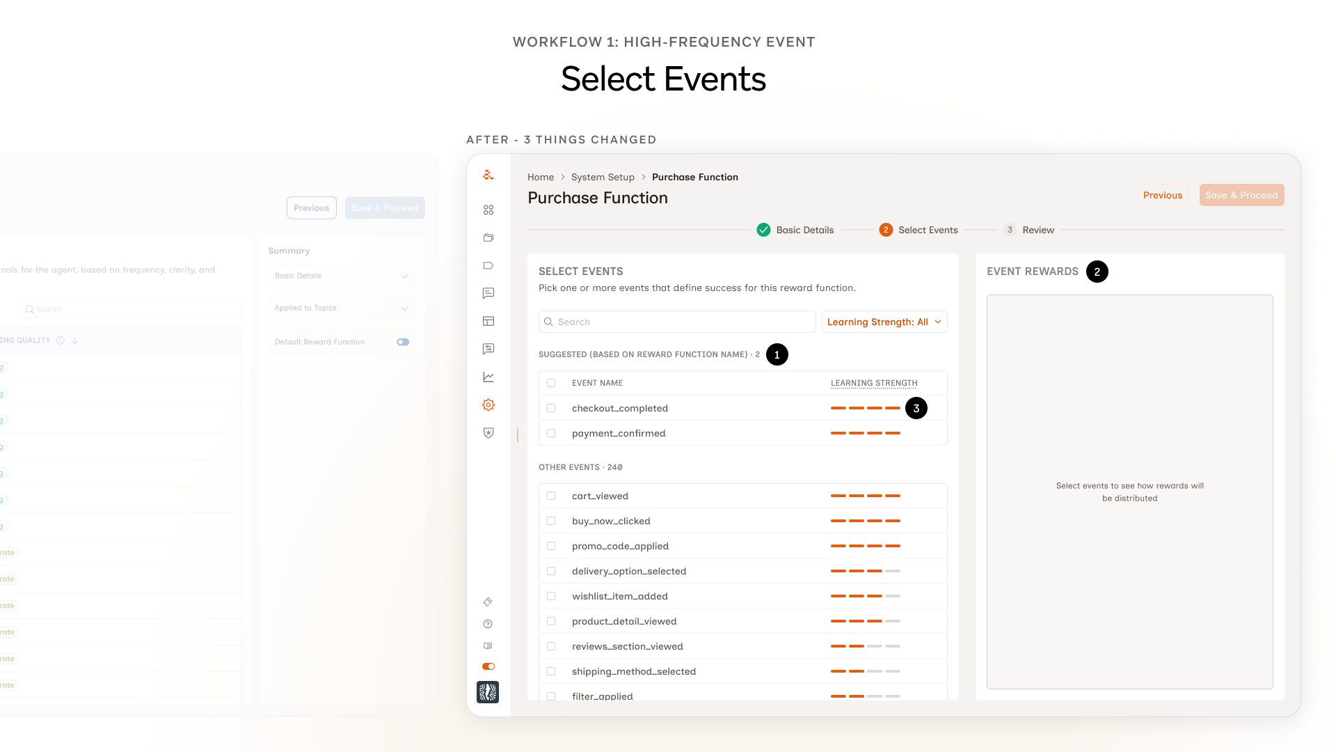
1. A Suggested group at the top of the event list. Marketers kept landing on the events screen and freezing. While watching, we noticed they were typing the same name they'd given the reward function into the search bar. They were trying to use it as a hint to the system. That gave us the hook. ML would have been the ideal way to do this but it would have taken months. So we grouped events on the backend and surfaced the most relevant ones as Suggested.
2. Event Rewards panel moved forward. Originally the marketer picked an event on Step 2, moved to Step 3, and saw the weights there. In testing, almost every marketer hit Step 3 and immediately wanted to go back, because the weights didn't match what they'd expected. Two screens away from the decision, the mental thread was gone. We pulled the panel onto the same screen as the event selection.
3. Chips became bars. Learning strength used to show up as chips: Strong, Moderate, Weak. The hover state existed, but marketers in testing only found it by accident. Most never hovered. The chip read like a verdict; nothing about it invited a closer look. The bar shape invites the interaction in a way the chip didn't.
Review and Approval
Two screens that didn't exist in the original flow. Both came directly from testing.
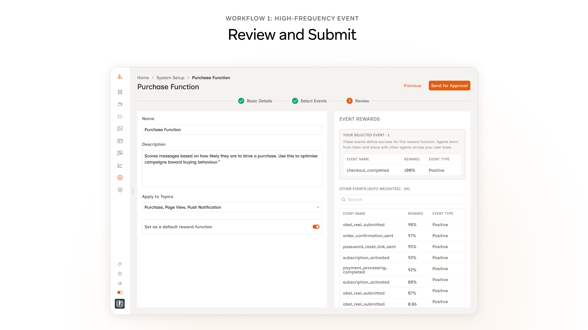
A Review screen before submission. In testing, marketers would reach the Save button and pause. A few asked out loud what would happen next. They wanted a moment to see everything they'd just configured before committing. The original flow ended at Select Events → Save, which felt fast in design and abrupt in use. The Review screen lets the marketer see the full reward function, the events they picked, and the rewards the system auto-assigned, before anything goes live.

A manager approval step. More than one marketer in testing mentioned they wouldn't actually click Save on something like this without their manager's sign-off. Not because they couldn't, but because reward functions affect how every message gets scored across every campaign for that customer. A wrong one breaks marketing in ways that aren't obvious for weeks. So we made approval a real step. The marketer drafts and submits, a manager reviews and signs off. Self-serve doesn't mean unsupervised. Self-serve doesn't have to mean unsupervised.
Workflow 2: The edge case
Workflow 2 starts exactly like Workflow 1. Basic Details, Select Events, the same screens, the same flow. The split only happens at the moment the marketer picks a low-strength event. That's when an extra step kicks in: they have to pair the low-strength event with a supporting event the agent can actually learn from. That extra step is the whole catch of Workflow 2.
The design challenge was making that extra step feel like part of the same flow, not a punishment for picking something rare.
What was wrong with the first version
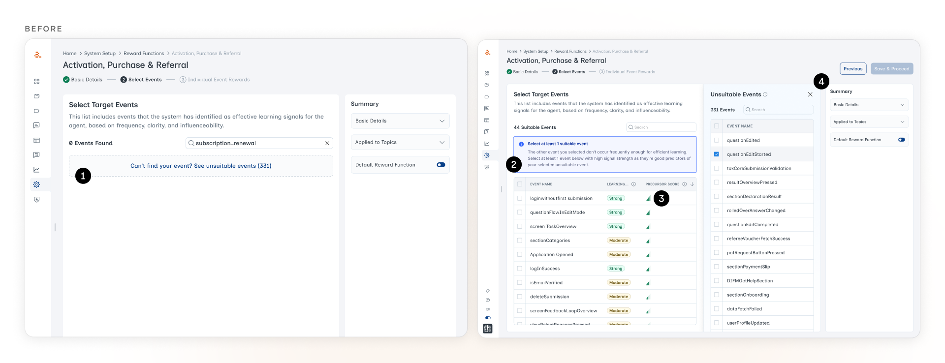
1. A dashed-border container that read as an empty state. The old design returned "0 Events Found" when a marketer searched for a low-signal event. The event existed, the system just pretended it didn't. The only way forward was a faint dashed-border link at the bottom of the screen. In testing, marketers didn't realize they could click it. They thought the search had failed.
2. The warning at the top read as a banner. Even after we surfaced the event with an inline explanation, the blue warning at the top of the screen kept getting ignored. It sat where every dismissible alert and cookie notice tends to live, and marketers had trained themselves to scroll past anything in that position.
3. "Precursor Score" meant nothing to marketers. The Precursor Score is the agent's signal of how strongly a candidate supporting event predicts the low-strength event the marketer picked. If someone picks subscription_renewal (low-strength), the system needs a higher-frequency event that tends to happen before renewals, like billing_page_visited. The Precursor Score is how the system ranks those candidates. The concept matters. The label didn't land. Marketers didn't recognize the term, didn't hover over it, and didn't use it to make their decisions. The column was doing real work the marketer couldn't see.
4. The new panel created spacing issues. When the marketer clicked through to see the full list of low-signal events, a new panel popped open in the middle of the screen. It pushed the existing content around, broke the alignment of the main events list, and made the screen feel cramped. The constraint we were trying to surface ended up creating a layout problem of its own.
What we shipped
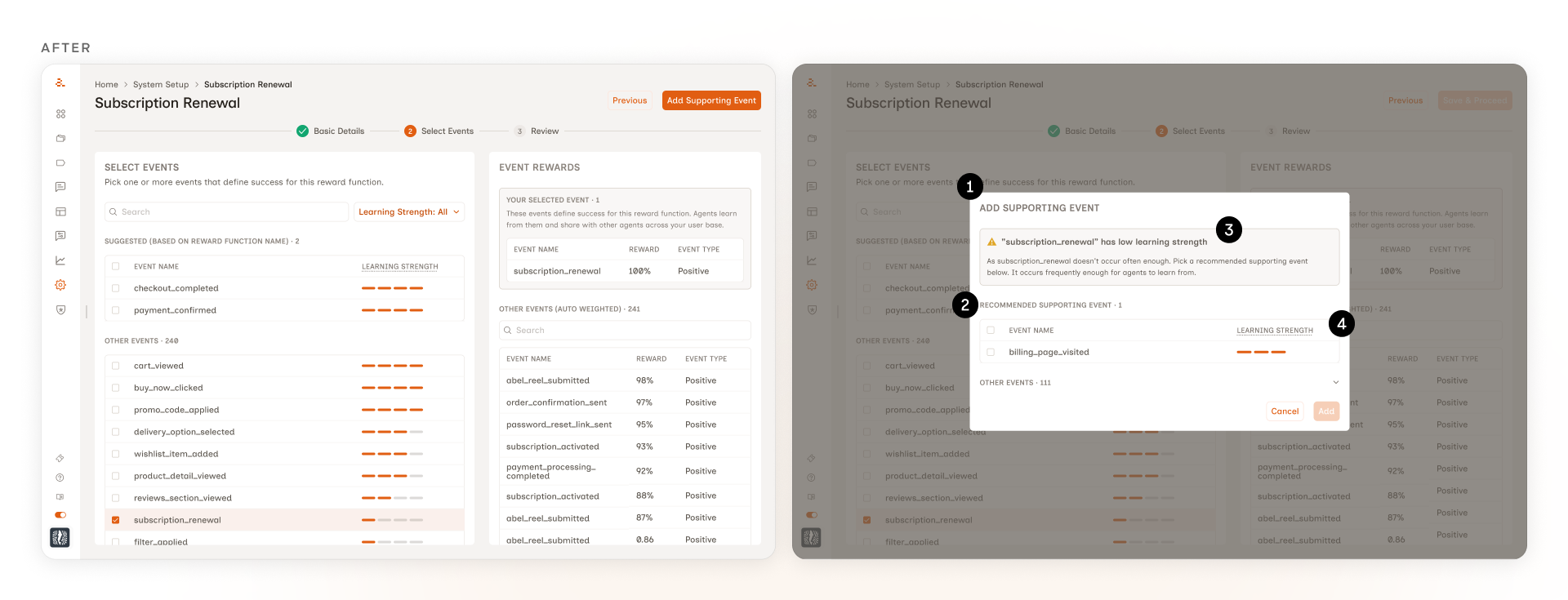
1. A modal, not another panel. The first version used a side panel that switched contextually based on what the marketer selected. It worked, but it asked the marketer to learn that the right-side panel did two different jobs depending on the selection. A modal scopes the supporting-event decision more discretely. It opens when it's needed, closes when it's done. No layout shifting, no spacing problems.
2. One recommended event, not a list. The marketer only needs to pick one supporting event. Showing them every option ranked by score would be decision noise. The modal surfaces the top-ranked recommendation by default, with the rest available below for marketers who want to override.
3. The warning sits inside the modal. The original design used a separate warning banner above the events. Testing showed marketers ignored it. The modal folds the same context into the supporting-event picker itself, so the why and the what read together at the moment of the decision.
4. The precursor score does the work, then disappears. The score still drives the ranking. The marketer just doesn't see the number. Showing it would have invited false precision and pushed marketers to optimize for a metric they didn't have context for.
Shipped to production
The feature shipped to production and is available to all customers. Existing customers kept their original reward function as the default, with the option to add more through the new flow. New customers got the multi-reward-function setup from the start.
Against the bar we set ourselves: marketers started creating reward functions on their own, without looping in CS or data science. The two customers we'd tested with were the earliest adopters, and the same flow rolled out to the rest of the customer base from there. Self-serve adoption became the signal we'd hoped for, not just a creation-rate spike.
What I'd revisit
The current design uses heavy inline explanations because testing showed marketers don't proactively explore tooltips. They needed the system to teach them in their path, not invite them to discover. As marketers grow familiar with the feature, that scaffolding compresses into tooltips. The design is calibrated to the moment, not to a forever state.
Want the long version?
The thing about case studies is they make the work sound cleaner than it actually was. The real work happened in the calls I didn't write about, the explorations that didn't make the deck, and the moments where customer testing made me rethink something I was proud of. If you'd like the unflattened version, I'd love to walk you through it. 30 minutes, your questions, my screen.
Book a call