Dover / CDS Mentor
From paper manuals to interactive 3D training
Dover Corporation trained factory workers using printed paper instructions and 2D drawings for 3D assembly work. I helped design CDS Mentor, an interactive 3D training platform built from scratch across 10 sprints and 8 design versions, tested with factory operators across Germany and Europe before rolling out across Dover's manufacturing network.
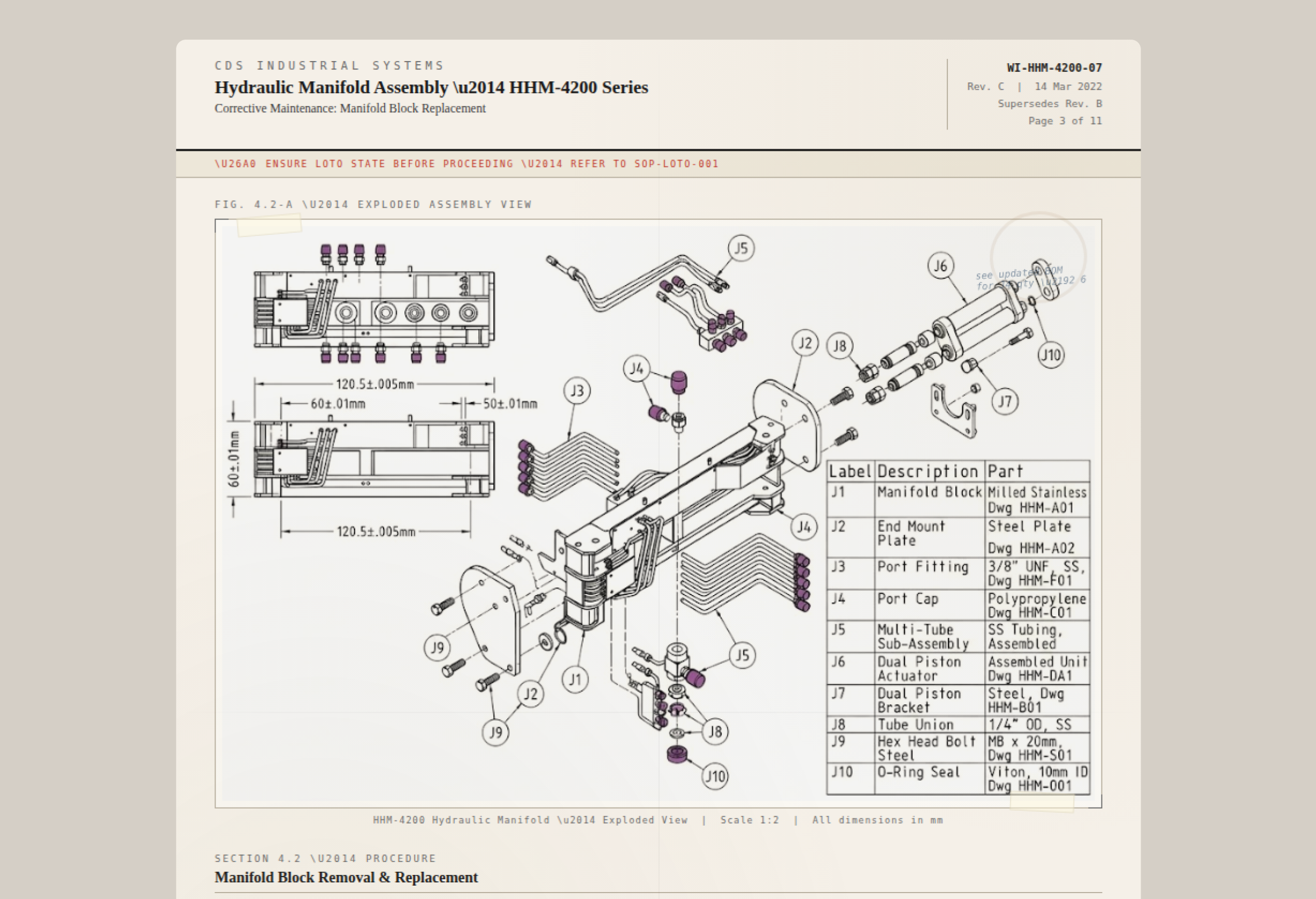
Factory workers at Dover Corporation were learning to assemble industrial products by reading printed paper instructions. The instructions were 2D drawings. The products were 3D objects. That mismatch alone should tell you how well it was going.
Why paper wasn't working
Dover Corporation is an American conglomerate manufacturer of industrial products. Every week, different products need to be assembled across their factories in Germany and throughout Europe. Before assembly starts, companies who own the product ship over paper documents explaining how to put things together. Workers get trained from those printed pages, then walk to the floor and try to match flat diagrams to the physical thing in front of them.
The problems ran deeper than the format. A minor change in assembly meant reprinting entire instruction batches. Workers misplaced pages mid-procedure. Managers had no way to track whether someone actually understood step 4 or just flipped past it. And the cost of printing, bundling, and distributing paper to every station added up fast, both in money and time.
Dover didn't want a PDF viewer. They wanted a platform that could fundamentally change how factory workers learn, practice, and execute assembly procedures, with interactive 3D models at the centre.
What we built
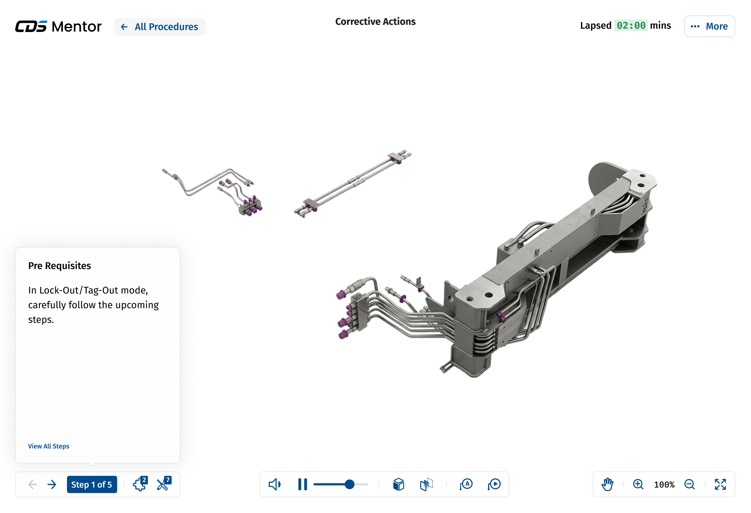
CDS Mentor: an interactive training platform that replaces paper instructions with step-by-step digital procedures built around manipulable 3D CAD models.
The scope covered three connected products: a trainee-facing app across desktop, tablet, mobile, and HoloLens; a trainer tool for authoring work instructions; and a 3D studio for adding steps and animations directly onto CAD models. This overview focuses on the trainee experience, the core screen that carried the most impact.
I worked as a product designer alongside a lead designer and one PM. We operated in weekly sprints, each with a dedicated objective and deliverable, over 2.5 months.
What we found
The existing product had a starting point, but after auditing it through a cognitive walkthrough, the issues were clear. Related information was scattered across disconnected areas of the screen. Step details lived in one place, step navigation in another. Icons were hard to parse. And there was no way to see which tools, parts, or time a given step required. Simple, but not smart.
How the design evolved
Over 10 weekly sprints, we worked through 8 major design versions. Each one wasn't iteration for the sake of it. Each one answered a specific question.
Versions 1 and 2 fixed the foundations. We grouped step information with step navigation (they were bizarrely separated in the original), made the step panel collapsible so the 3D model could breathe, and introduced lapsed time tracking so trainers could spot which steps were causing friction.
Version 2 went to usability testing with operator teams across Dover's factories in Russia, Germany, and China. The feedback was specific and actionable: they wanted parts and tools information per step, media references visible on the model itself, the ability to break procedures into segments, and a space for paper instructions alongside digital ones (old habits die hard, and good design respects that).
Versions 3 through 6 responded to those insights. We layered in annotations and labels directly on the 3D model, added per-step parts and tools information, introduced question prompts so trainers could verify comprehension mid-procedure, and reworked the layout to an 80/20 split as step information grew more detailed.
Version 7 consolidated everything into a clean, structured interface. Procedure name centred. Lapsed time visible. Step info combined with navigation at bottom-left. Model controls at bottom-centre. Utility controls at bottom-right. Every piece of information finally had a home that made sense.
Version 8 was a one-line fix that mattered more than it sounds: we swapped the background to white after PMs flagged that light grey components were disappearing against the previous background. Small change, big difference when you're training someone to identify specific parts.
Before and after
The original product had 7 capabilities: a basic step wizard, simple navigation, step details, 4 view controls, rotate-only object interaction, play/replay, and fullscreen.
The final design shipped as a sophisticated, omni-channel training system: steps overview with rich procedure details, per-step parts and tools information, 9 view controls, pan and zoom on objects, play/pause/replay/scrub with audio narration, lapsed and estimated time tracking, peripheral annotations layered non-intrusively onto the 3D model, in-procedure feedback collection, and a responsive experience across desktop, tablet, mobile, and HoloLens.
The takeaway
"Digital" isn't a format change. Turning paper into pixels solves nothing if you don't rethink what training actually looks like when the instruction and the object can finally exist in the same space. The biggest design decisions on this project weren't about layout or icons. They were about understanding that a factory worker standing at a station needs information structured around what they're doing right now, not organized the way it was convenient to write.
Want the full picture?
The full 8-version design progression, usability testing insights from international teams, 3D interaction design, and responsive adaptation across desktop, tablet, mobile, and HoloLens are available on request.
Request Walkthrough